


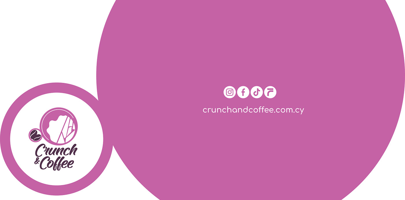

The pink and purple color scheme is deliberately chosen to captivate attention, presenting something fresh and distinctive compared to the usual color palettes seen in other cafes. These vibrant hues embody a sense of modernity and uniqueness that sets Crunch & Coffee apart, inviting customers to experience something new and exciting.
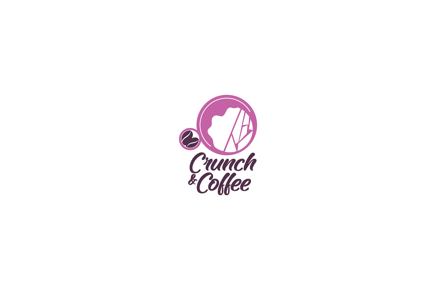
The circular design elements within the logo symbolize both a cup and a plate, subtly hinting at the cafe's offerings of both beverages and food. The plate, depicted within the larger circle, contains food, representing the satisfying crunch of a delicious meal. Meanwhile, the smaller circle within contains coffee beans, illustrating the core essence of the cafe – the aromatic brew that fuels the day.
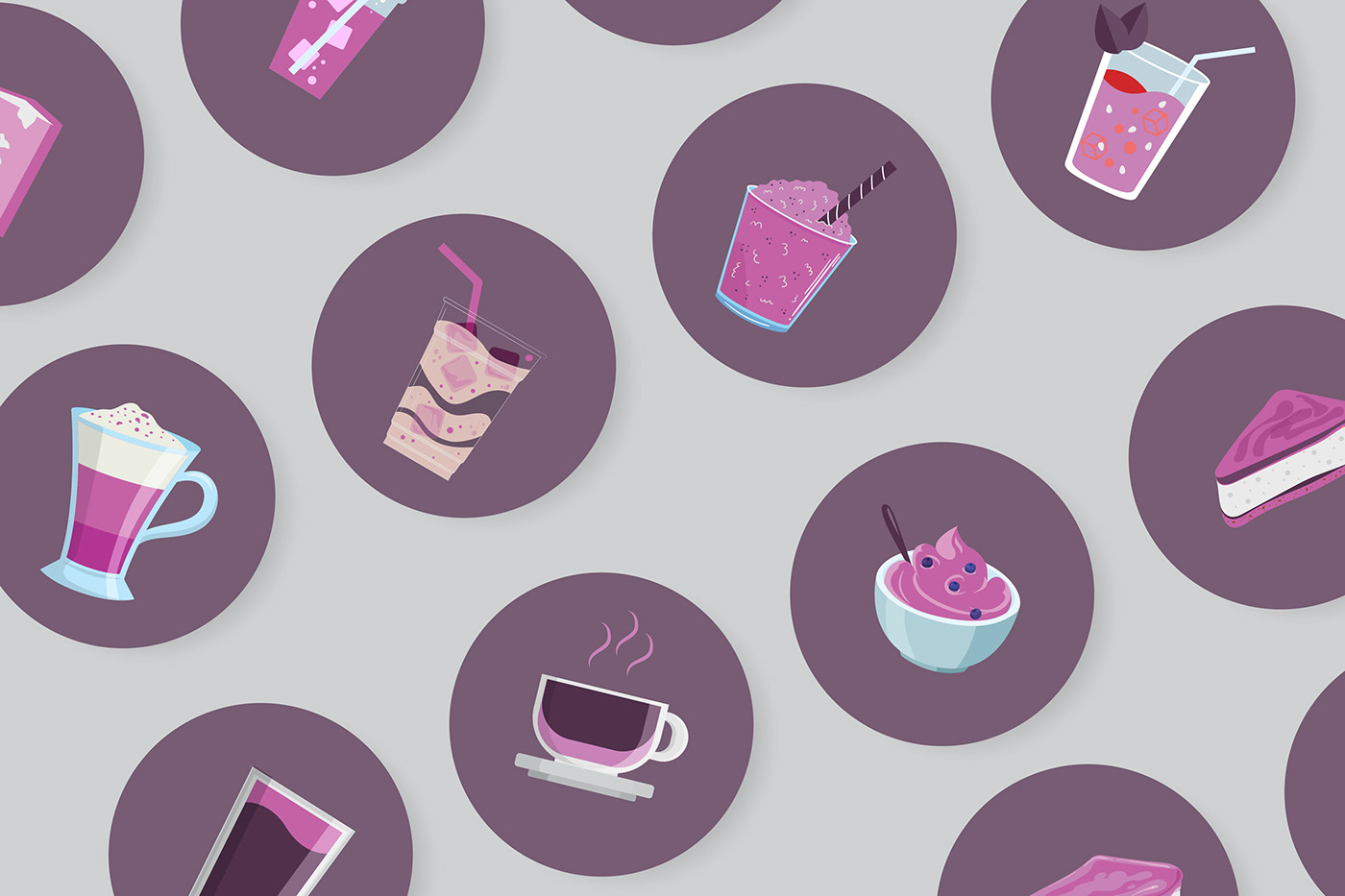
Every icon incorporated into the brand identity serves a purpose, contributing to a sense of richness and contemporary flair. Collectively, they represent the diverse array of delectable treats and beverages available at Crunch & Coffee, promising a tantalizing experience for every visitor.
The circular design elements within the logo symbolize both a cup and a plate, subtly hinting at the cafe's offerings of both beverages and food. The plate, depicted within the larger circle, contains food, representing the satisfying crunch of a delicious meal. Meanwhile, the smaller circle within contains coffee beans, illustrating the core essence of the cafe – the aromatic brew that fuels the day.
Every icon incorporated into the brand identity serves a purpose, contributing to a sense of richness and contemporary flair. Collectively, they represent the diverse array of delectable treats and beverages available at Crunch & Coffee, promising a tantalizing experience for every visitor.
